Two seminal dates in the history of user interfaces for digital computing devices are January 24, 1984 and June 29, 2007.
The former was the date when Apple launched the first Macintosh with an iconic Super Bowl ad that many consider to be the greatest single ad of all time. The Mac was the first mass-market personal computer with an integrated graphical user interface and mouse. Before that, we were all using clunky command-line MS-DOS.
The latter date was when Steve Jobs re-invented the user interface again – and computing and gadgets in general – with the iPhone. For all us who use iPhones or Androids essentially 24x7, the skepticism the iPhone was met with at launch is nothing short of hysterical in retrospect. Here’s a small sample:
“Apparently none of you guys realize how bad of an idea a touchscreen is on a phone. I foresee some pretty obvious and pretty major problems here.”
“I’m not impressed with the iPhone. As a PDA user and a Windows Mobile user, this thing has nothing on my phone.”
“I’ve got touchscreen buttons on my Samsung i730 and it sucks.”
With some 2.6 billion smartphone users worldwide at last count, it’s undeniable that the iPhone completely transformed how the world uses phones – and made us all believers in the power and convenience of touch-based user interfaces. With this context, it seems appropriate that in the same month as the iPhone’s 10th anniversary that Tektronix would introduced the world’s first oscilloscope with a user interface that – like the iPhone – was designed from the ground up around a touch screen interface.
Over the years, many consumer and industrial devices have adopted touch-based user interfaces with varying degrees of success. For the most part, UIs that incorporate touch as an afterthought never amounted to much and were quickly discarded. It’s only when touch is done right, that is designed specifically for intuitive touch-based operations, that it gains traction.
The reasoning behind a touch UI on a scope make sense on a lot of levels. One is that for millennials touch is what they expect, so its smart to give them the option of using their preferred UI as they move into the workforce. Another is that some test benches get so crowded that there is literally no room for a mouse and keyboard. Also, since scopes are visual instruments, a touch UI offers a way to maximize screen real estate.
All those reasons are valid, but none of them screams this is “why I must have a scope with a touch UI.”
And, guess what, we would agree.
The real reason you’ll want to use the new touch UI on the 5 Series MSO is that it makes you more productive. It saves you time. A fully optimized and context aware touchscreen is more efficient than knobs and buttons or even a mouse and cursor. The controls you need to capture and analyze signals are literally right at your fingertips. Instead of having to scroll through menus, the controls you need are a tap away. Expected features like pinch to zoom are all there. Here’s the tricky part. Unlike a phone or tablet, pinching or zooming not only scales the display, but it also sets the precision amplifiers, filters and sampling systems on this precision instrument – practically in real time.
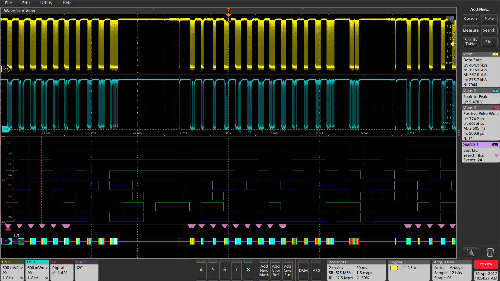
If you look at the screen shot of the 5 Series MSO UI below, the first thing that stands out is the massive waveform viewing area, made possible in part by the massive full HD 15.6-in. capacitive touch display. The upper right section gives you immediate access to cursors, notes, measurements, searches, results, tables or plots. The lower section on the right column is the results bar where measurement and search results are displayed in blocks we’re calling badges. The lower left is for the displaying waveform details, again as badges. The next block corresponds to channels and gives immediate access to math, reference and bus waveforms. Moving further along the bottom, you’ll see a section for critical horizontal, trigger and acquisition parameters.

What this layout provides is fast, intuitive access to the information and parameters you need along with more space to view waveforms. Space to view waveforms is always a good thing, but even more important when debugging complex designs with lot of digital and analog channels that need to be displayed simultaneously. To that end, the 5 Series MSO features a revolutionary new Stacked display mode shown in the screen shot below.

Here's what Patrick Mannion had to say about this in his Test.Pass feature on Electronic Design:
“Tektronix really did focus on helping users keep track of and clearly view waveforms, to the extent that it added a new Stacked display mode. Unlike traditional viewing of multiple waveforms, all waveforms now can be observed clearly, without overlapping, and at the full ADC range for the waveform for maximum accuracy.”
Stacked display mode compares favorably to the way scopes have traditionally handled multiple waveform where they were all overlaid in the same graticule. To make waveforms visible you had to vertically scale them so they didn’t overlap. Since each waveform uses a small percentage of the available ADC range, you ended up with less accurate measurements. The other option was to overlap the waveforms, but then you couldn’t see signal details on individual waveforms. Of course, the 5 Series MSO still supports this method, but we’re guessing that you’ll opt for Stacked mode more often than not.
The intuitive, responsive and even fun way of using the 5 Series MSO didn’t just happen by chance. It was the result of much user interface testing and countless design and re-design sessions. It also had an impact on hardware and underlying software. Pinching and zooming on life waveforms, for instance, is much different than scaling a photograph and took considerable effort to achieve the immediate response like what you get on a smartphone. It was hard and it took a large team to accomplish, but we think it was worth the effort.
To see the new 5 Series MSO in action, please take a few minutes to watch the video below where Product Planner Gary Waldo walks through the UI and other features of the new scope. Chances are good that Gary know whereof he speaks since he led the UI design effort. Enjoy.